
A label for a water bottle:
Case studies for a redesign of the "Basler Wasser"
The design of a label for a product such as water need
a creative approach where both, respect of a traditional
product and originality for a modern appearance are
needed. The market is competitive and the look of water
bottles have changed drastically in the last decade, as it
becomes more and more a trend product.
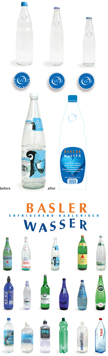
As the studio who developped the corporate image of the "IWB" – the Energy Company of the town of Basel – our team is used to respect the visual identity of this client and is flexible enough to expand the logo's imagery on other supports. A bottle of water was the perfect opportunity. While such assignment could give us the opportunity to increase the range of the "IWB" visual presence, it was expected from us to give our personal interpretation of the water. We understood quickly that as a proof of purity, the Basel Water is at the same time the metaphor of each other products at the IWB. Pure. Safe. Reliable. The Basel Water is pumped from a small natural source filtered and botteled by a local producer. It is sold manly in Basel and it's region. 3 agencies were brought to compete for a solution. The deliverable were first a logo for the product. Secondly a label that had to fit a given bottle. Developed within 2 intensive weeks with our team, this exploration shows our great interest toward beverages and products such as water. It demonstrate our ability to find quickly creative solutions. We developed 3 parts: A cap, a logo and the label. The top: Bottles lean either horizontally, or vertically in cases. In both situations, the first things ones sees is the cap of each bottle. Our first goal was to give an identity to the product by using the cap as one of the main recognizable element. For us the cap is like a hat, as the bottle stands for the body, the silhouette of the product. The mark: We studies ways to emboss the logo of IWB, so that the bottle carries the mark of a certain elegancy. For the logo, we used the idea of reflection in water. We combined the two words "Basler" and "Wasser" which contain the same amount of letters and when reversed to each other looks almost like the same word. The dress: The label had to fit a standard bottle which was inelegant and heavy looking. As an additional limitation, the format of the label was also given, so we found some additional surface at the back of the label, where all the secondary informations can be placed. The day we could work on such a particular product like water, was a great chance for our creativity. Such a simple product is delicate to design, as water is one of the most vital product in life. Accompanying us in each meal, water is an element which is present with each of us during our most important moments of the day. |
