
Design for a restaurant:
Food experience goes true eyes and taste in
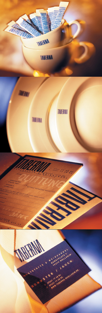
a tavern of South Germany
The visual for this new restaurant situated in a small village of
south Germany was again an interesting opportunity for the team
of Studio AND to work in the field of gastronomy.
The inner-architecture, in what was a mill about hunderd years ago, was already defined and all materials, furnitures, and the interior design where already in place when we were hired. This village-restaurant needed a simple but strong visual to be adapted in all it's printed matters where it's brand was needed. The solution is a simple one blue typographical application of all the letters of the name "taberna" which composed very close to each other into a logotype and repeated everywhere become more a visual mark to remember than a word to read. The blue typographical logotype express the simplicity of the place, the clear and clean space and adapt itself well with the playfull style of the kitchen. From the chef and waitress clothing up to the menu, from all the plates, cups and napkins to giveaways such as matches or sugar packs, the visual of this restaurant had to be visually present but not too "pushy". However, by its presence it became a part of the experience. The name which the client choose was "Taberna" comes from the Latin and mean "Tavern" whose original meaning was a shed or workshop. The distinction of a tavern from an inn, bar or pub varies by location, in some places being identical and in others being distinguished by traditions or by legal license. A tavern or pot-house is, loosely, a place of business where people gather to drink alcoholic beverages and, more than likely, also be served food. |
